Create a flat vector illustration with the exact same composition and layout as the reference image.
Do not change the placement, proportions, or arrangement of any elements.
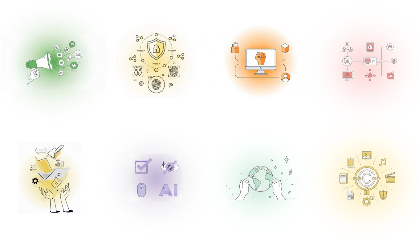
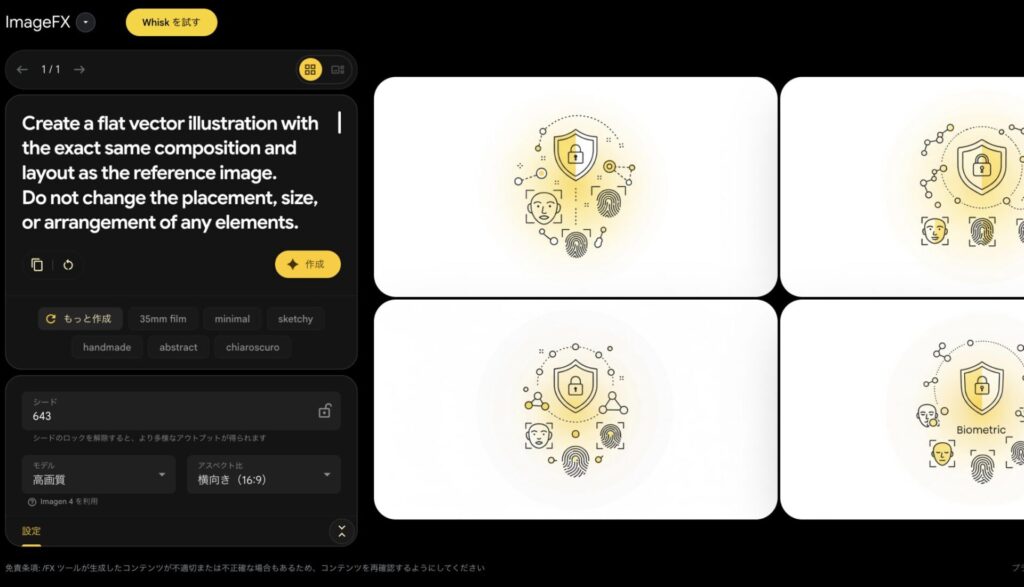
he illustration shows:
-A computer monitor centered on a stand
-A raised fist icon displayed on the screen
-A padlock icon connected on the upper left
-A cube/block icon on the upper right
-A user profile icon on the lower right
All elements are connected with rounded lines forming a rectangular flow.
Style:
Clean, modern flat icon illustration
Thin outline strokes, slightly thinner than standard line icons
Smooth rounded corners, simple geometric shapes
No textures, no shadows, no realism
Colors:
All filled areas use ONLY orange-based tones or pure white
Allowed fills: soft pastel orange, pale peach, light amber, and white
Do NOT use any blue, green, gray, or other colors for filled areas
All outlines and strokes are neutral light-to-medium gray only
Background:
A very subtle circular radial gradient in light orange tones
The center of the gradient is gently saturated with a soft orange
Gradually fading outward into extremely pale orange or almost white
Very low contrast, soft, blurred, and airy
The background should be barely noticeable and never overpower the illustration
Overall:
Flat vector UI/UX illustration style
Light, calm, and minimal appearance
Plenty of white space
No text, no 3D effects
Exact same visual hierarchy and structure as the reference image
生成画像
プロンプト②
Create a flat vector illustration with the exact same composition and layout as the reference image.
Do not change the placement, size, or arrangement of any elements.
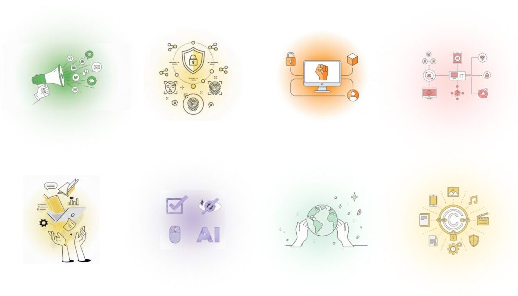
The illustration includes:
A shield with a lock icon positioned at the top center
Biometric icons such as face recognition and fingerprints arranged below
Small connected nodes and dotted circular connection lines around the main icon
Style:
Minimal, clean line-art illustration
Thin black or dark gray outline strokes
Rounded shapes, simple geometry, no textures, no shadows
Modern editorial and SaaS-style illustration
Colors:
Filled areas use very soft yellow-based tones only (pale yellow, light cream, soft warm ivory)
No blue or green colors
Line art remains monochrome
Background:
An extremely subtle, blurred circular radial gradient
The center of the circle is only slightly tinted with a very pale warm yellow
Gently fading outward into almost pure white
Very low contrast, soft diffusion, barely noticeable
No hard edges, no visible gradient boundaries
Overall:
Flat vector style with lots of white space
Calm, light, and airy appearance
No text, no realism, no 3D effects
Exact same visual hierarchy and structure as the reference image